
Architectural Photography for Glassdoor Offices in San Francisco

Adding human elements to the images really adds a ton of life to the scene. Sure, this could have still provided the necessary information of the space without them, but the architecture needs to be shown serving the people.
A Very Rewarding Day of Architectural Photography:
In December of 2021, I drove up north from Los Angeles and had the privilege of shooting some really cool architectural photography for my new friends over at Valerio Dewalt Train & Media Objectives in San Francisco. I am thrilled to finally release the first set of these images into the wild featuring the new offices for GlassDoor.
We had one day to shoot 27 images during one of the shortest days of the year, so it was an early start and a long exhausting marathon with very rewarding payoffs in the end.
The shoot needed to highlight distinct features of the office space that would make it an exciting and appealing place to work, particularly with employees scheduled to return to the office after two years of working from home. My clients were tasked with shaping two floors of a 1960s-era 24-story International-style high-rise located in the South of Market area of the city.
It was an absolute all-hands-on-deck team effort with the architects and other employees from the office providing their time as models, and labor as we had a ton of furniture to move and style with not much daylight to work with.
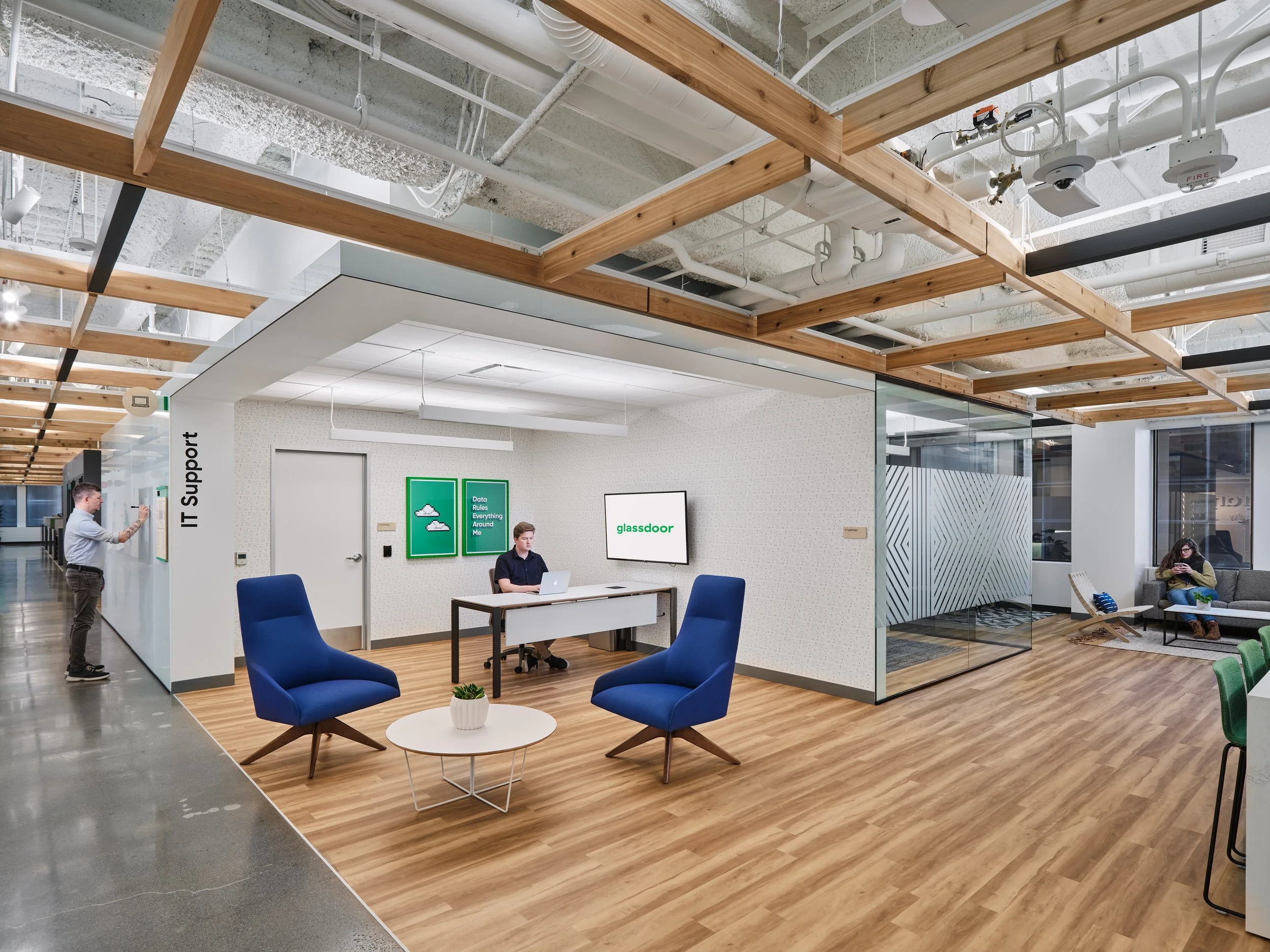
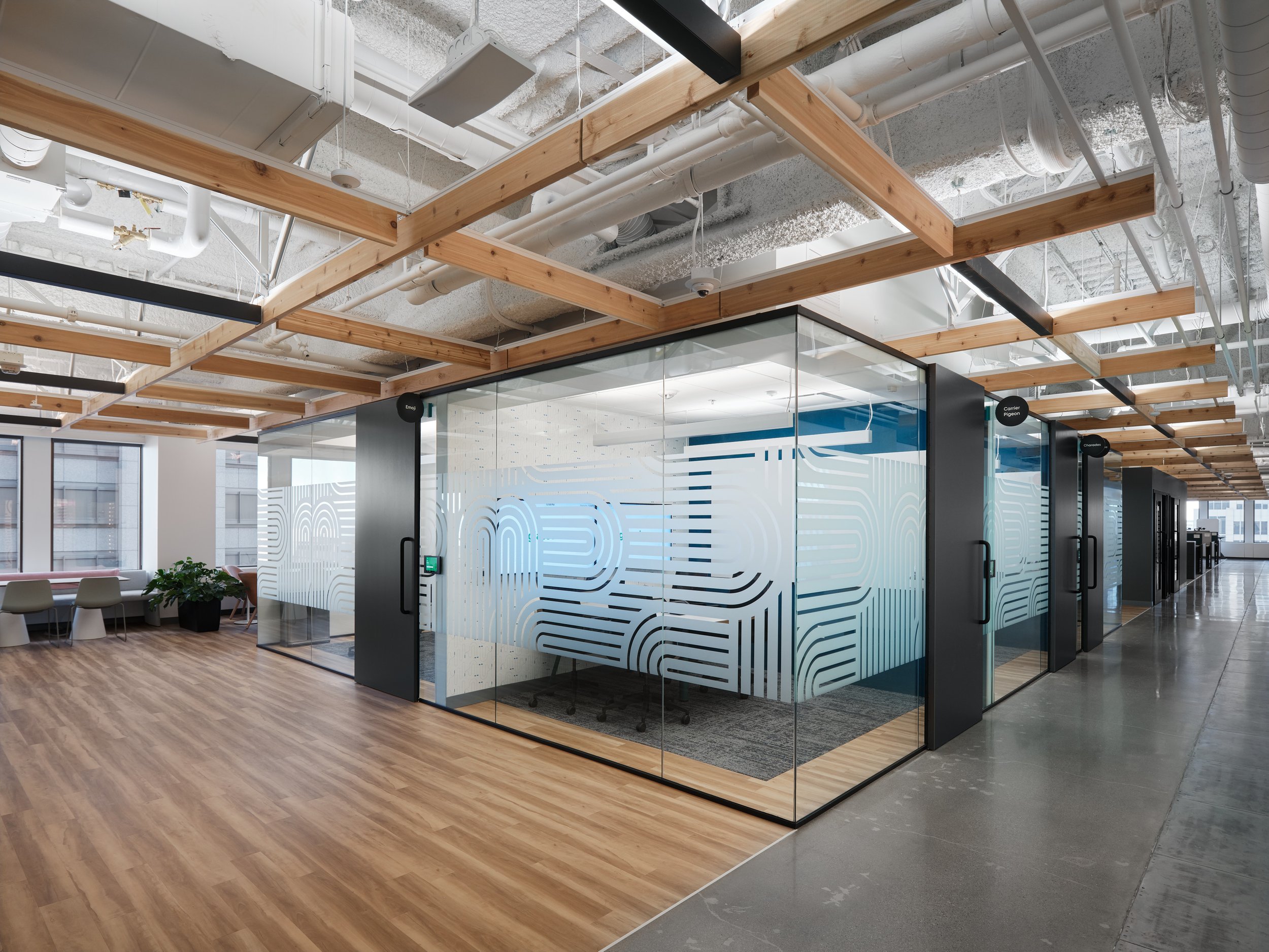
There were a ton of features to highlight, and some (such as a really cool game room) that unfortunately just didn’t make the cut due to time restrictions. Interlocking circulation loops, custom supergraphics on the walls, glass conference walls, and sharply distinct flooring materials that help with wayfinding all needed to be documented. I also found it interesting that each of Glassdoor’s offices prioritizes stylistic, historical, and whimsical elements of their respective city, which are on full display in these images.
Below are the best examples I’ve curated that best tell the story of how the architecture serves the brand and the people who will come to work and play in the space.
The One To Rule Them All
The cover image above is one of my favorite captures from the shoot as it comprehensively highlights how functional the design is. There is plenty of open space for spontaneous interactions, while still having an abundance of private offices, secluded nooks for reflection or quiet convos, and meeting rooms for when you need to focus. The wall as a whiteboard invites an instant platform to brainstorm or present ideas on the fly.
This photo was shot from the door of an office similar to the one at the very back with a 50mm lens to really compress the background and make the details stand out. No supplemental lighting was used. This was all beautiful, airy window light. Good design makes my life easy. In Architectural photography, it’s important to recognize when less is more.

A little cinematic mood never hurt anyone. When appropriate, less light can often do a better job serving the image as there’s more opportunity for depth, texture, and atmosphere.
A Moody Library
This was the first shot of the day and was a hell of a challenge to shake the cobwebs of an early morning call time. We had scouted the day before and still weren’t committed on a composition. After a bit of pacing back and forth I concluded that this shot could work better as a vignette and that it wouldn’t be necessary to show off the whole space with a wide lens. This simple photo tells you exactly what this space is for and became my personal favorite of the whole series.
This was mostly natural light minus a giant 7 foot umbrella I used to light the talent to give a soft, cinematic far side key on each subject motivated by the practical lights bouncing off the ceiling, which gave the room natural soft light to begin with. The rising sun bouncing off the buildings outside created beautiful fill light to bring balance to the scene.
The Elevator Pitch
This was probably the simplest shot of the day. The lighting design of these elevators is perfect. No supplemental lighting needed with the LED strips providing the quality of light I’d have tried to emulate with my flashes anyway. The rest was just a matter of getting the right exposure in camera and posing our talent. That same overhead lighting brought the protruding depth in the wooden numbers on the wall, which was a crucial design element to feature for the client.

Architectural Photography Is a First Impression
First impressions matter. It’s how we often judge things for better or worse. Below we have the main lobby for the Glassdoor offices where visitors can wait for an audience or be directed to a variety of areas throughout the two floors. As you might have guessed, it’s one of the first things they’ll see when interacting with the brand in San Francisco.
We had to make the images as warm and inviting as it was in person, and spent way too much time arranging that curvy couch in such a way that it either acted as a border to frame the space (in the first image) or as a leading line to the elevators (second image) that maintain’s the viewer’s sense of space. It really came down to a game of inches as we obsessed over the right placement while making sure to keep it from getting too close to the lens to avoid it being disproportionately large in the frame.
Once again the symmetrical LEDS on the roof provided that beautiful, cinematic top light that I love, so the only supplemental lighting needed was on the talent to make them pop a bit more. The light fixtures are also perfectly aligned with the building’s grid.

The triangular placement of our models offers a balanced canvas for the viewer’s eyes to focus on each of the primary design elements

Here we wanted to show interconnected functions of the lobby in relation to the rest of the offices. The central heartbeat.
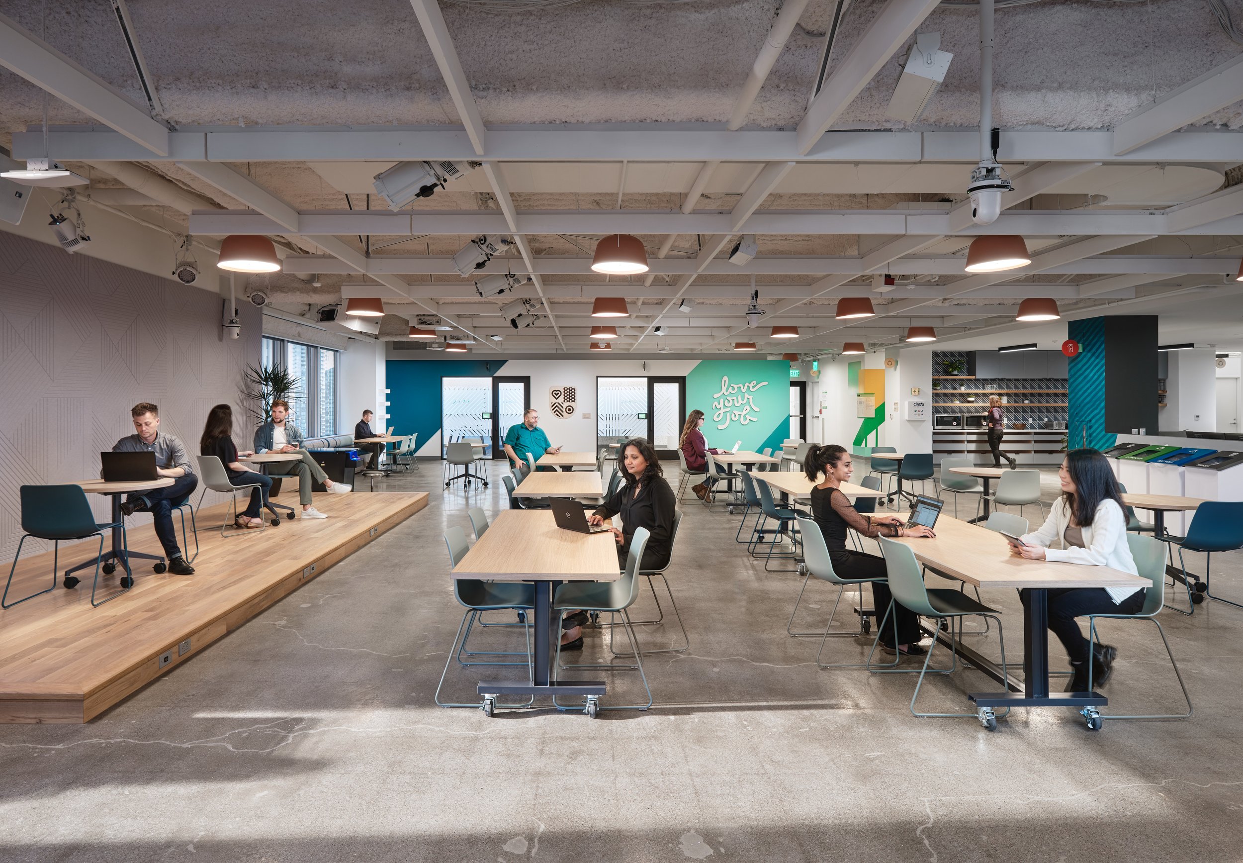
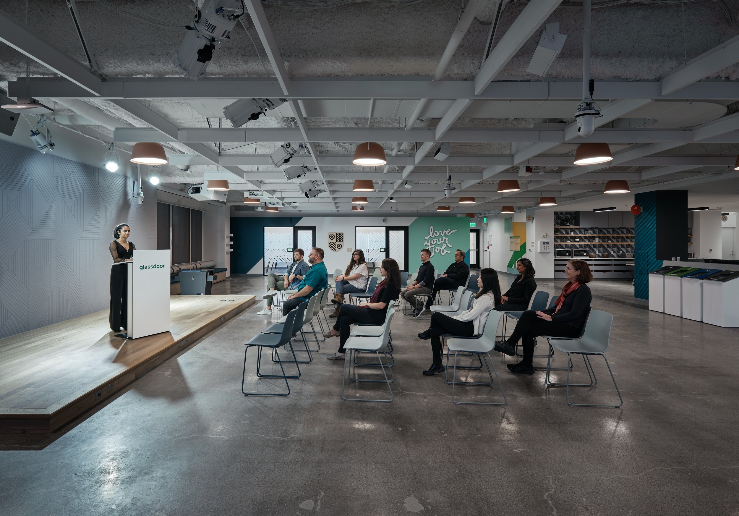
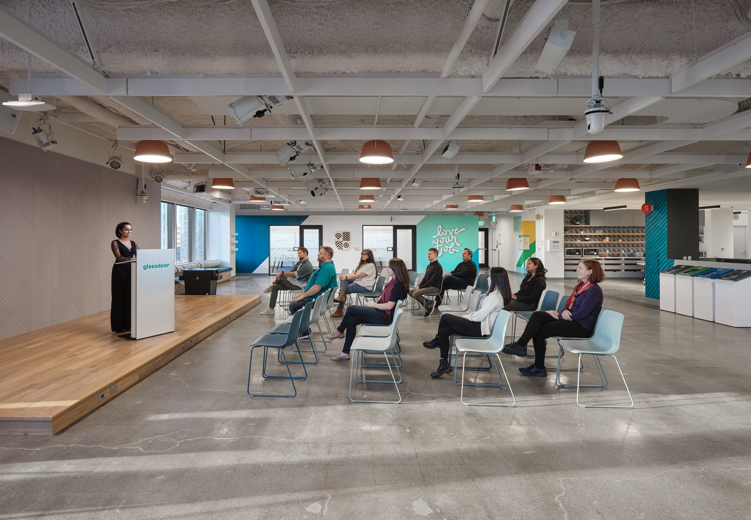
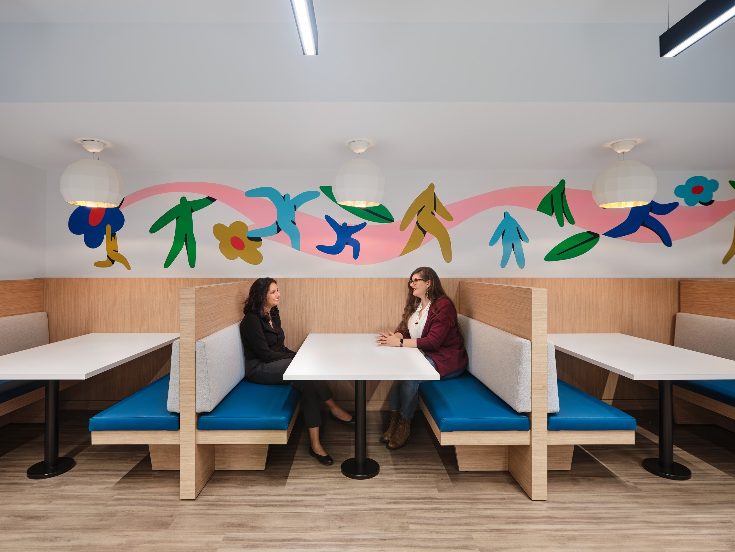
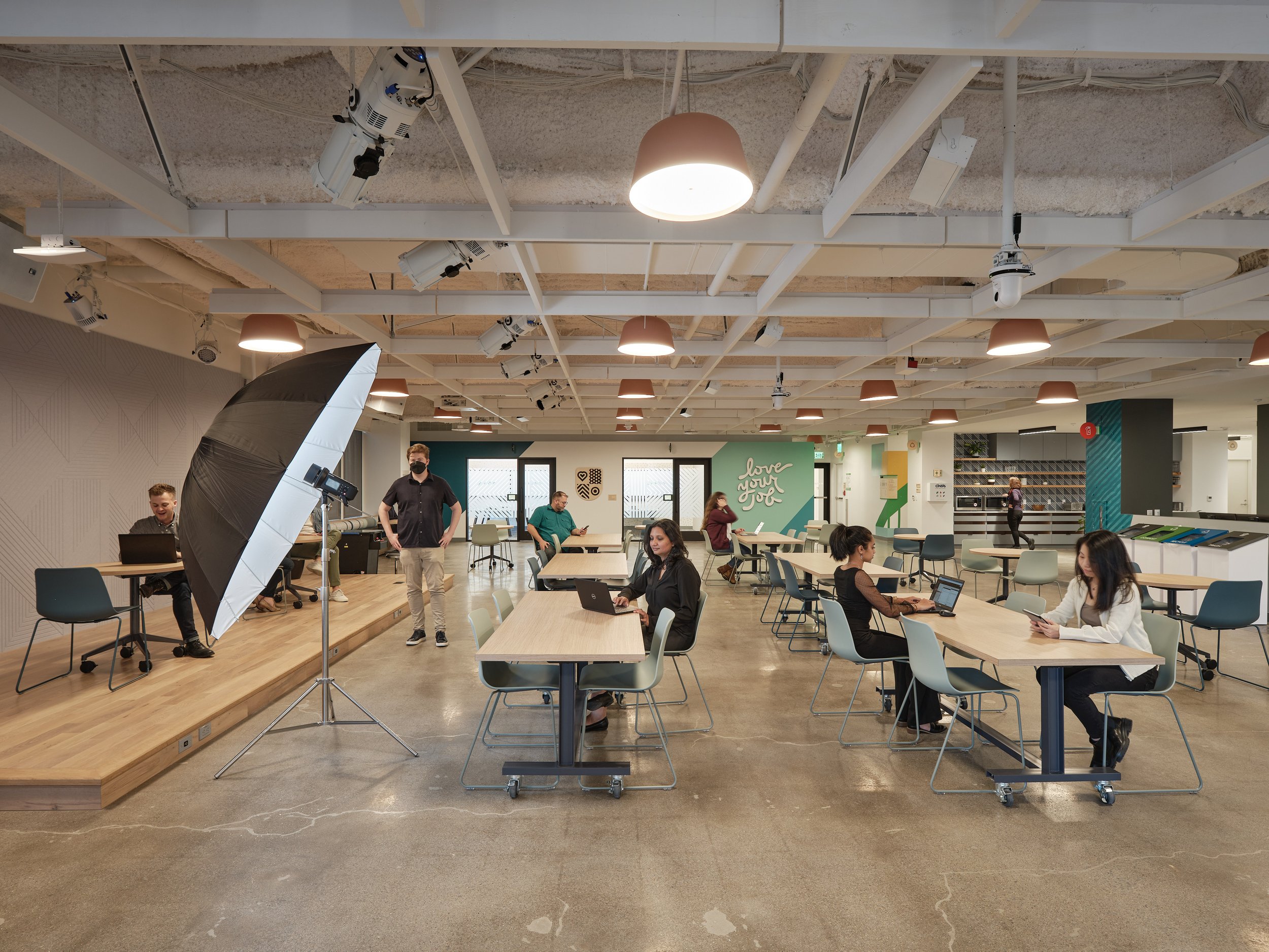
A Flexible Cafeteria
These shots have to take home the day’s “all hands on deck” award as they were the most labor intensive and time consuming images. We had to rearrange the the tables and furniture throughout the lunchroom for three different images to accurately display the flexibility of the room as an eating space, lecture hall, and theater/ presentation space.
Time was not on our side with the sun dropping lower int the sky with every second, so it would have been impossible to accomplish without the help of the VDT and Media Objectives team who donated their time to the cause. We would have simply run out of time.
The shots themselves were quite simple. I left the tripod in the same exact spot so that we have seamless transitions between the variations of images and lit each one accordingly.

When Art Meets Architecture
A prominent San Francisco Artist was commissioned to create this mural in the lunch room and capturing it within the context of the environment was crucial. I could have probably taken this shot with a wider lens closer to the subjects, but the distortion would have been unfavorable as the humans would have been very large in the frame and the architecture very small. Instead I chose to physically move the camera back and use my 50mm Tilt shift lens to take several plates shifting the lens horizontally and stitching them together to create these panorama that shows the width of the installation while providing a favorable compression to the background and proper proportions to our humans.
Architecture is for Humans
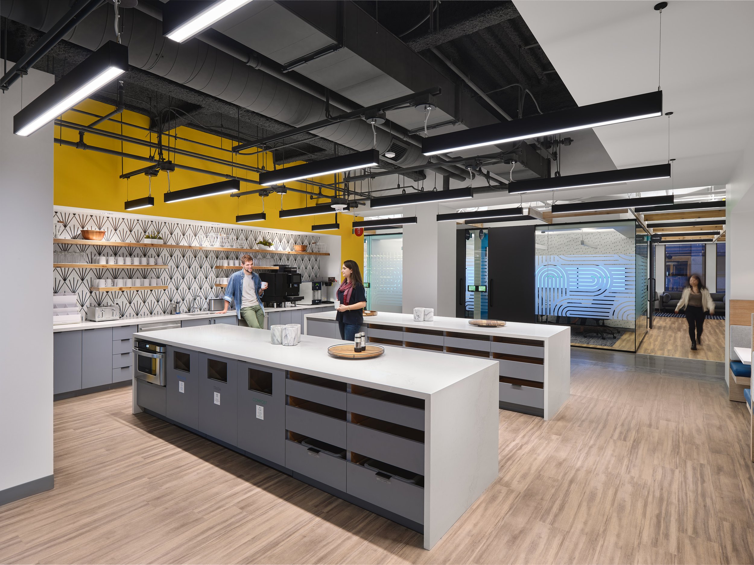
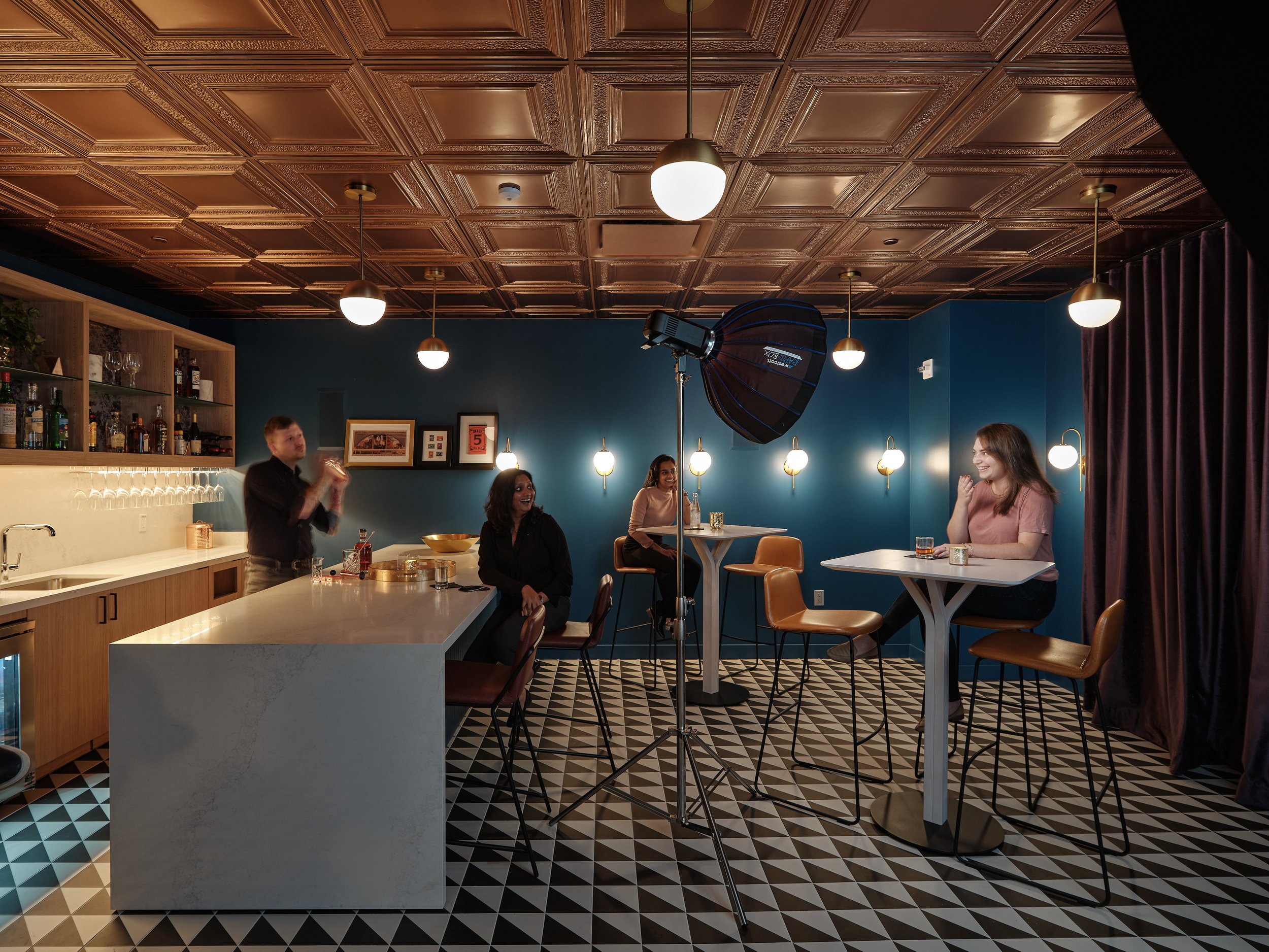
Spaces for socialization and fun were also a key component to the design. Given that employees in the tech industry spend such a large portion of their time at work, making it as pleasant as possible should be a priority. An a charming if anochronistic phone booth uses it’s walls to disguise the door that lead’s into the office Speakeasy. This warmly lit, secret room with dark finishes and traditional tin ceiling tiles provides a small bar for the office, and a place where employees can disconnect from work and reconnect with each other.
I love lighting scenes like this because you have total control of the lighting. I can diagnose the direction, quality, and color of the room’s practical lights and recreate it with a more polished effect while preserving its integrity. The lack of windows was a big help because it meant I wouldn’t have to flag them or try to overpower ambient light from outside sources.

This image was shot at the end of the day when were all a little exhausted and loopy. These may or may not be real libations.

As someone with a real passion for environmental portraits, I savor the opportunities for these types of shots where I can really frame a space in use with human elements. The human adds a scene of scale and breathes life into the architecture, and the architecture creates a character out of the environment to add context to the story of our human.

The door to the speakeasy is hidden behind a wall in a phone booth that can be pushed open. Invisible to all but those who are already in the know. For this shot, we chose to add some motion blur to our human element to create a sense of movement and show that the door is meant to be pushed open. This was achieved with a combination of flash to light our subject while dragging the shutter while our subject pushes the door open. It took about 12 takes to get it right, but I feel like it made for a memorable image.
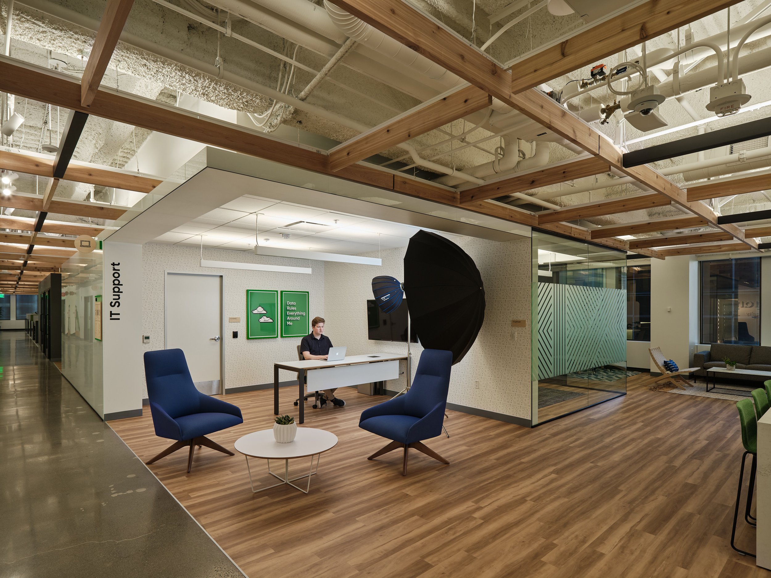
Grid and Patterns
One of the design elements that was crucial to capture was the wooden grids on the ceilings which are reinforced with the building’s grid system and create a web of warmth and nature throughout the office. Capturing it required shifting a bit higher on my tilt shift lenses than i normally go for interiors, but was a breeze nonetheless. It’s one of the millions of reasons why these lenses are treasures that will accompany me to the grave.


This conference room contains a butler’s pantry behind the ornamental sliding door. We wanted to show the function of the space, so chose to have some motion blur to show that the door slides to reveal the space behind it. However, we also wanted to to show that the patterns on the walls continued on the doors. This required a shutter speed that was slow enough to show the movement, but not too slow as to completely obscure the geometry on the door. We found a happy medium.
BTS
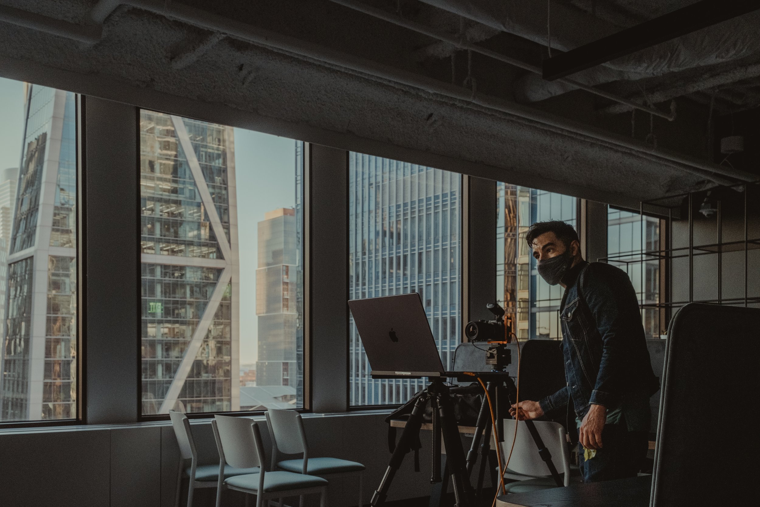
First shot of the day after a very early call time to make the most of our time. I was probably half-asleep here, but my brain must have activated auto-pilot. My favorite shot of the shoot was the end result (the moody library shot at the top). Clearly my conscious mind isn’t needed and can be laid off to trim so dead weight. Special thanks to Francisco Lopez De Arenosa, my client contact (who should get his flowers for getting it done behind the scenes), for getting this shot of me in my element. It’s my personal favorite shot of me doing what I do. So I guess two personal favorites were created at the crack of dawn.
A peek at the lighting:
Photography would not be possible without lighting. Adding, subtracting, what to leave in, what to leave out. The are the fundamental variables we balance in every frame. My philosophy is to augment and enhance what’s already there and never try to force circle in a square peg. I believe in the church of motivated light and always position my light sources to align with the practical lights in a space whether they’re lamps, over head lights, moody candles or big open windows. Part of the process is also recognizing when it’s not necessary to add anything, or just as importantly when it’s appropriate to subtract (flag) light to create depth and contrast.

The obligatory team photo at the end of the night. Exhausted but fulfilled.
And That’s a Wrap:
Thank you so much for joining me on this architectural breakdown. I want to give one final thank you to the team over at Media Objectives for trusting me with this project and having faith in my vision. They were just awesome to work with and brought the best energy to a shoot. I love photographing architecture. It really does bring me a profound sense of joy, but make no mistake, photoshoots are hard work and there is plenty at stake. It helps when everyone on set is a great human being. Above was the final memory of the shoot. Exhausted, but proud of a job well done enjoying some well-earned beers.